Nearly a decade ago I attended Edward Tufte’s Presenting Data and Information. I recently came across my notes for the talk, and decided to publish online as some of the takeaways, particularly the introduction of a “Story Canvas” had a significant impact on my information communication style in the decade sense.
The key principle of Tufte’s talk was that the software we use to create presentations come with a cognitive bias built in. In short, don’t be afraid of Word, Publisher, Excel and PDFs, and other tools of communication outside of PowerPoint. I’ll cover the more on the cognitive bias of PowerPoint later.
Additionally, Tufte focused on the importance of spark lines, integrating text with words, and the creation of ‘Super Graphics’. Finally Tufte encompassed his talk with the Six Principles of Analytical Design.
Use Cases: Tufte’s style of data presentation and communication differs significantly from the methodology preached in Storytelling, Speaking PowerPoint, The Presentation Secrets of Steve Jobs and other Presentation philosophies you may have encountered. Tufte’s philosophy is more aligned with Advanced Presentation Design and the work of Steven Few. So with all these competing Philosophies, which to follow? Well the answer is simple “it depends”. There is no one way to present data and you should use those most comfortable to you. However Tufte’s style is ideal for working sessions of Analysis vs. presentations where the goal is to provide highlevel information, reach high level agreement, and to inspire.
For those who prefer to work in a data oriented methodology you should consider ways of shifting the agenda from one of inspiration to joint problem solving. A key requisite for this style of presentation is audience buy in. I’m working on a framework to marry these disjointed concepts but in a meantime consider this your caveat emptor for Tufte’s concepts.
The Cognitive Style of PowerPoint
Notes: Every software program has its own cognitive biases. For example a letter created in Word will tend to be more verbose than a letter created in Outlook, because the cognitive bias of Word is toward filling out the page getting rid of the empty white space with sentences. PowerPoint’s cognitive bias is toward declarative statements vs. expository. Also PowerPoint’s cognitive bias is a forced hierarchy prioritizing key concepts into neat and organized bullet points. Assume intelligence for your audience.
There a few easily identified complaints about PowerPoint:
(1) it doesn’t encourage analytical thinking- it fosters more of a linear march through where any discussion is a detour to the broader point,
(2) the sequencing of slides because of the shallow content density per slide important thoughts are either simplified to the point of inaccuracy or arbitrarily cut off to form new slides;
(3) PowerPoint gives too much weight to the title of the slide;
(4) the density of information is weaker than paper or the presenters talk.
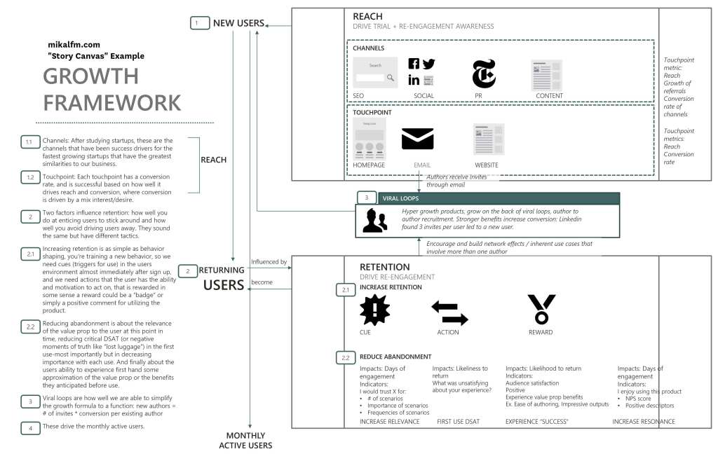
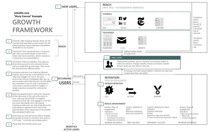
The solve Tufte recommends and I’ve taken to is adopting what I call a Story Canvas. A canvas with a full map of callouts. The entire meeting is spent stepping through the interlocking parts. The benefit of this approach is you can both take advantage of higher information density than PowerPoint and better defining visual story/relationships than Word.
First sketch your story canvas on paper or a whiteboard, layout it out as you see fit in either a super high-resolution PowerPoint (or I use InDesign) and print out on a tabloid paper.
Conclusions
When you’re fighting with PowerPoint’s information density and one slide per idea constraint, it is probably time to switch tools. With this post I hope to make the idea of a Story Canvas (Which I’ll break out further in a future post).
For in-depth, bring accompanying paper handouts which have a higher density of information. Or consider replacing PowerPoint all together in lieu of a Story Canvas. Additionally, edit the style of PowerPoint to your purposes and overcome the bias of the presentation software. Avoid the ‘long windy road’ of meetings (how we got here, where we are, what we’re going to do).
Caveat Emptor: Tufte’s underlying point is that presentations should be created in word not PowerPoint. Keep in mind your audience expectations dictate a lot, no one is expecting Tim Cook to lead MacWorld with a discussion of an inch think report. Identify the goals of your presentation for example to persuade, inform, analyze or reach agreement; choose the technology most suitable to your goals. And remember Steve Job’s goal is to wow a captive audience- it’s rarely our goal.
about the author
Mikal is a reformed startup CEO and experienced Product Executive based in Austin, TX. After years leading product teams at Microsoft, Nordstrom and most recently VP of Product at RetailMeNot, he now serves as a product coach helping teams in growing tech markets work their way up The Product Team Ladder.
subscribe (it’s free)
I’ve been writing business notes since 2005 (as notsocommoncents) – join my newsletter, sent every Tuesday, to read notes for the week on topics that go beyond the daily news cycle, plus any new blog posts.
You should sign up – and hear about an awesome thing each week.

2 thoughts on “The Limits of PowerPoint. . . Reflecting on Tufte’s Presenting Data and Information Talk”
Comments are closed.